Rondivoo · Founding Designer · 2022
0 → 1: The making of Rondivoo
Getting students off their phones and onto campus.
- Role
- UI/UX · Research · Branding
- Timeline
- Dec 2021 – 2022
- Team
- Solo design · 2 eng · 1 mktg
- Platform
- Mobile
- Status
- Launched · Fall 2022
01 — Overview
Filling a gap in campus life
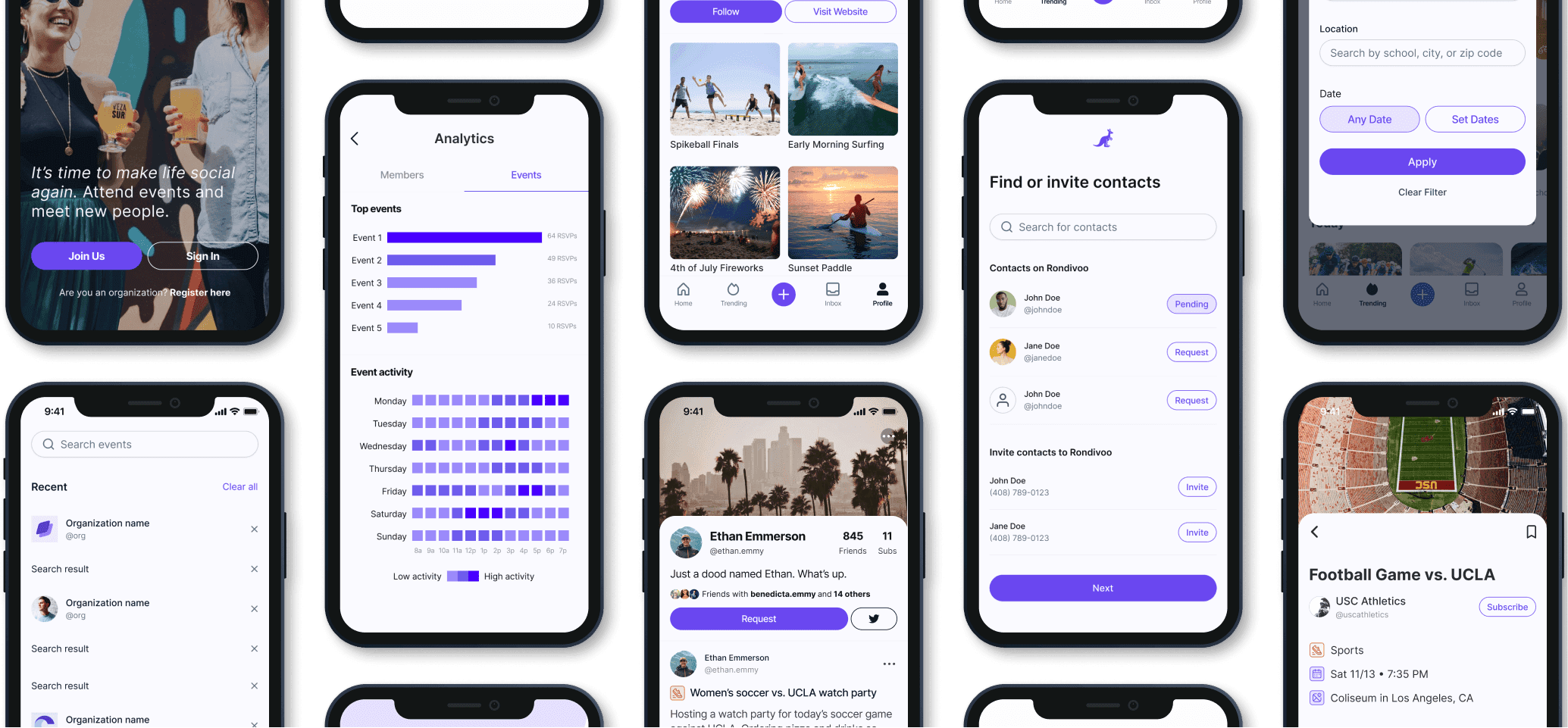
College is supposed to be where you make lifelong friends and memories — but the pandemic gutted campus engagement. Rondivoo is an events promotion and discovery app built to boost real-life social engagement across campuses. I joined at the very start as the founding designer, owning research, UI/UX, and brand.
02 — The problem
Outdated directories, disconnected students
Campus club and event directories are outdated and lack any sense of immersion. Two questions framed the work: how might we make it convenient for students to find and attend on-campus events, and how might we personalize it so the right opportunity surfaces faster?
The stakes are real: Pew finds Gen Z reports high rates of anxiety and depression. Students need peer networks and outlets for stress — and a hard time finding them.
03 — The goal
Become the campus go-to
The bet was big: increase social engagement across campuses, help students discover and actually attend activities, and become the go-to platform from freshman year through graduation.
04 — Process · Validation
Proving it before building it
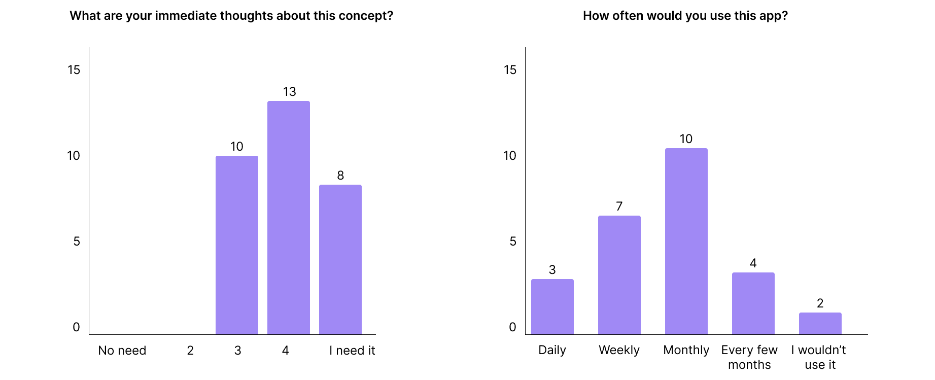
Before a line of code, I ran concept-validation testing with 25+ USC students using a mock prototype — pressure-testing whether the idea was worth building at all.
Prove it before you build it.
05 — Process · Research
Advocating for the student
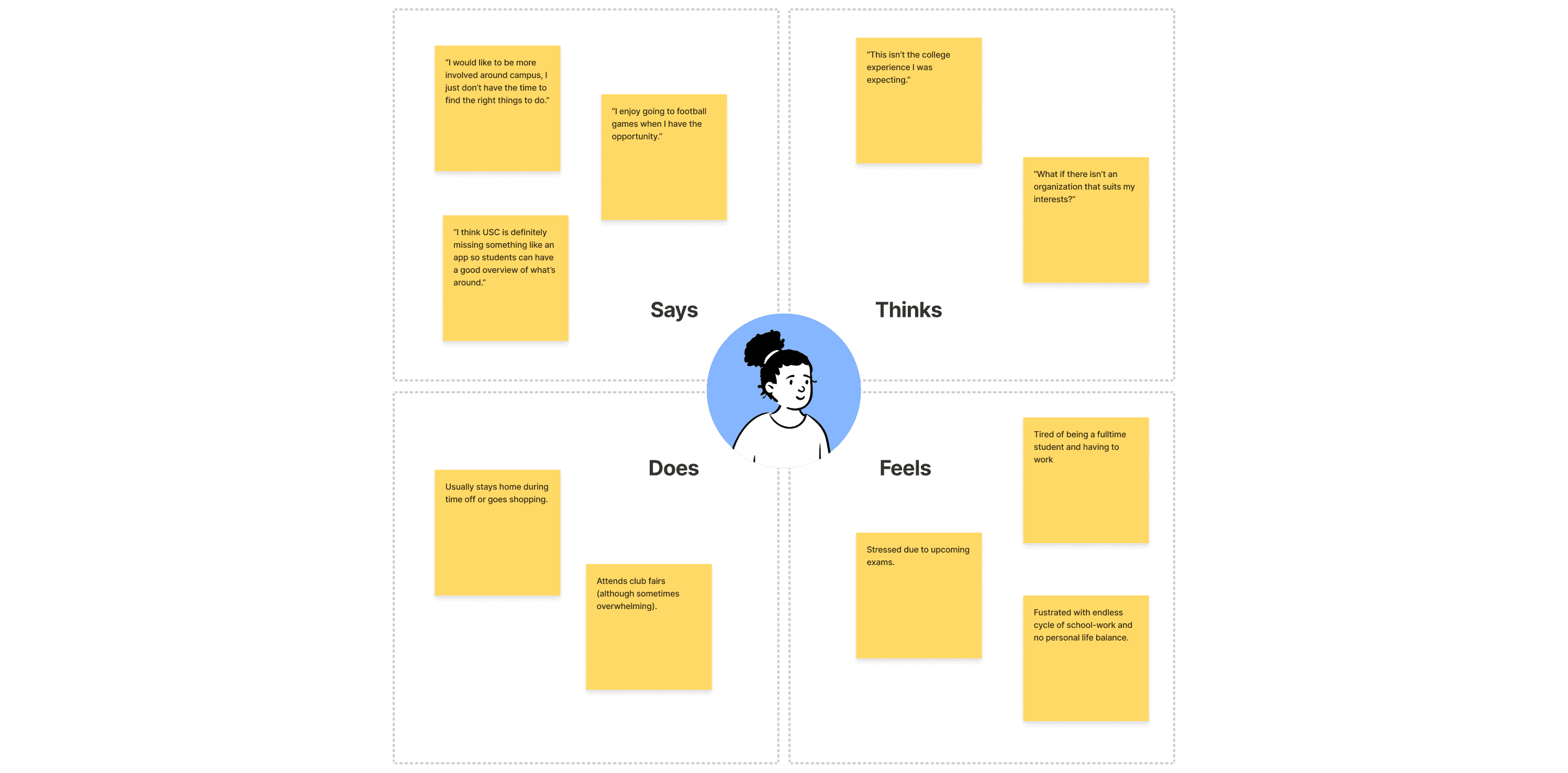
I interviewed enrolled USC students about school–life balance, social goals, how they meet people, and how they'd feel about a campus-life app — then aggregated them into an empathy map. Empathy maps and personas are at the heart of design thinking; they keep the team advocating for the student.
06 — Process · Structure
From paths to first pixels
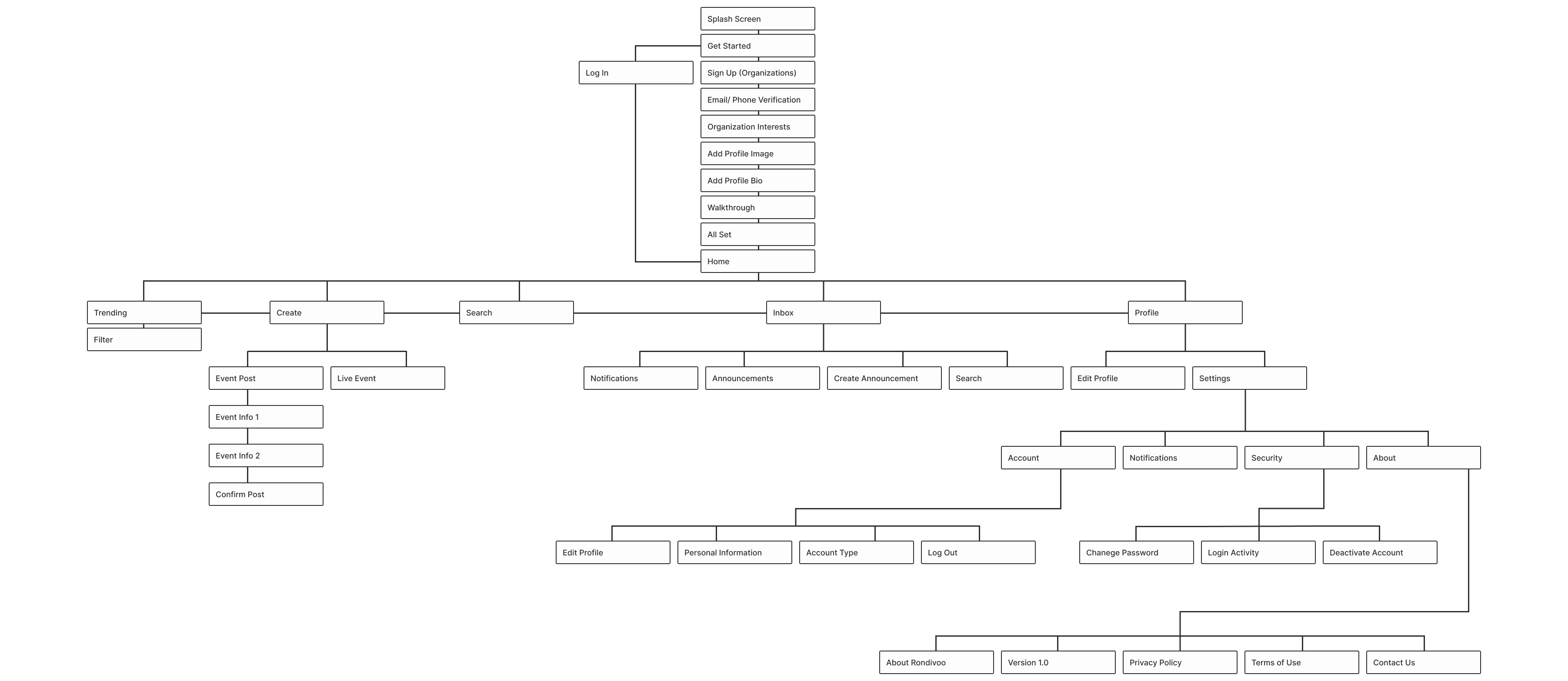
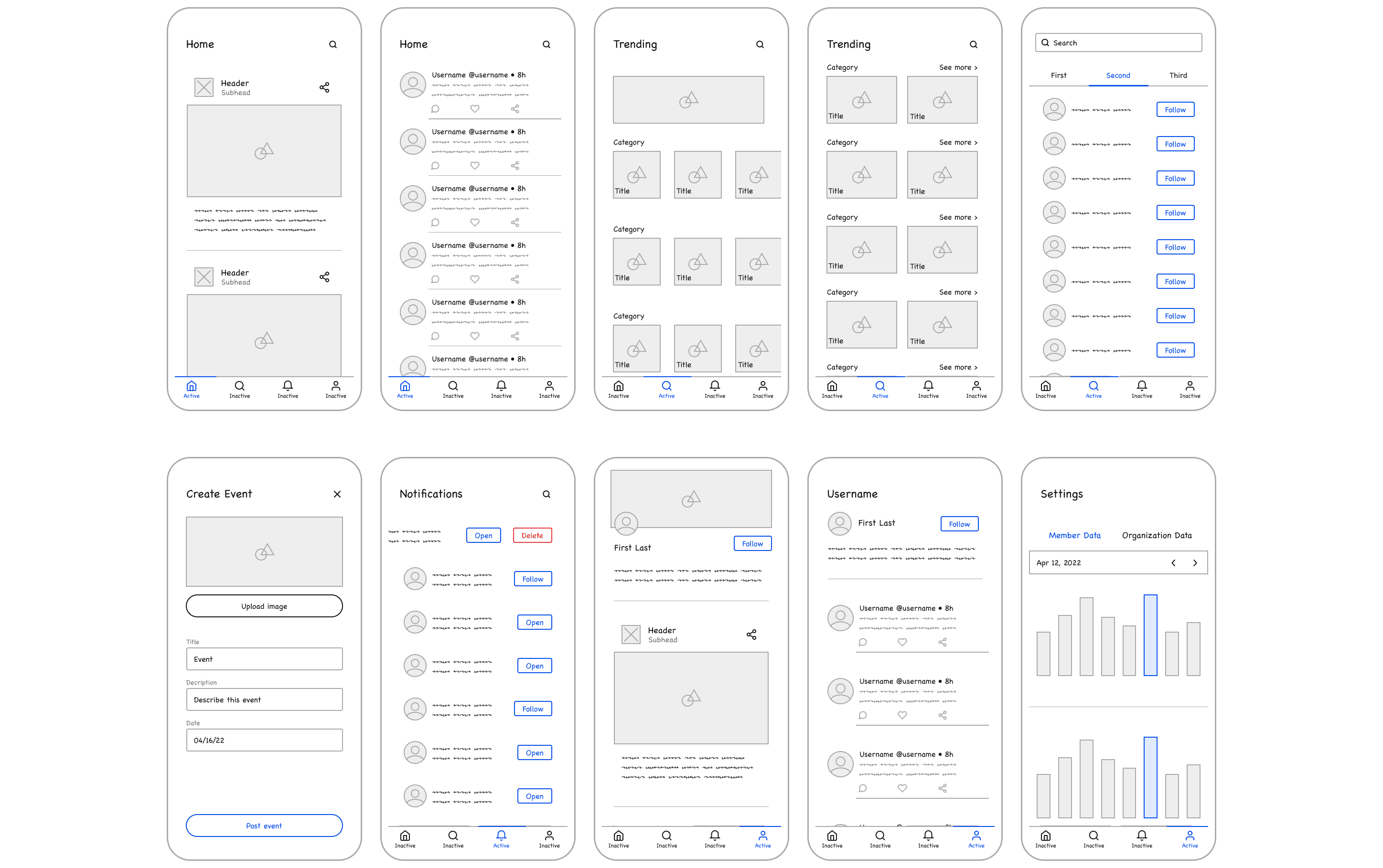
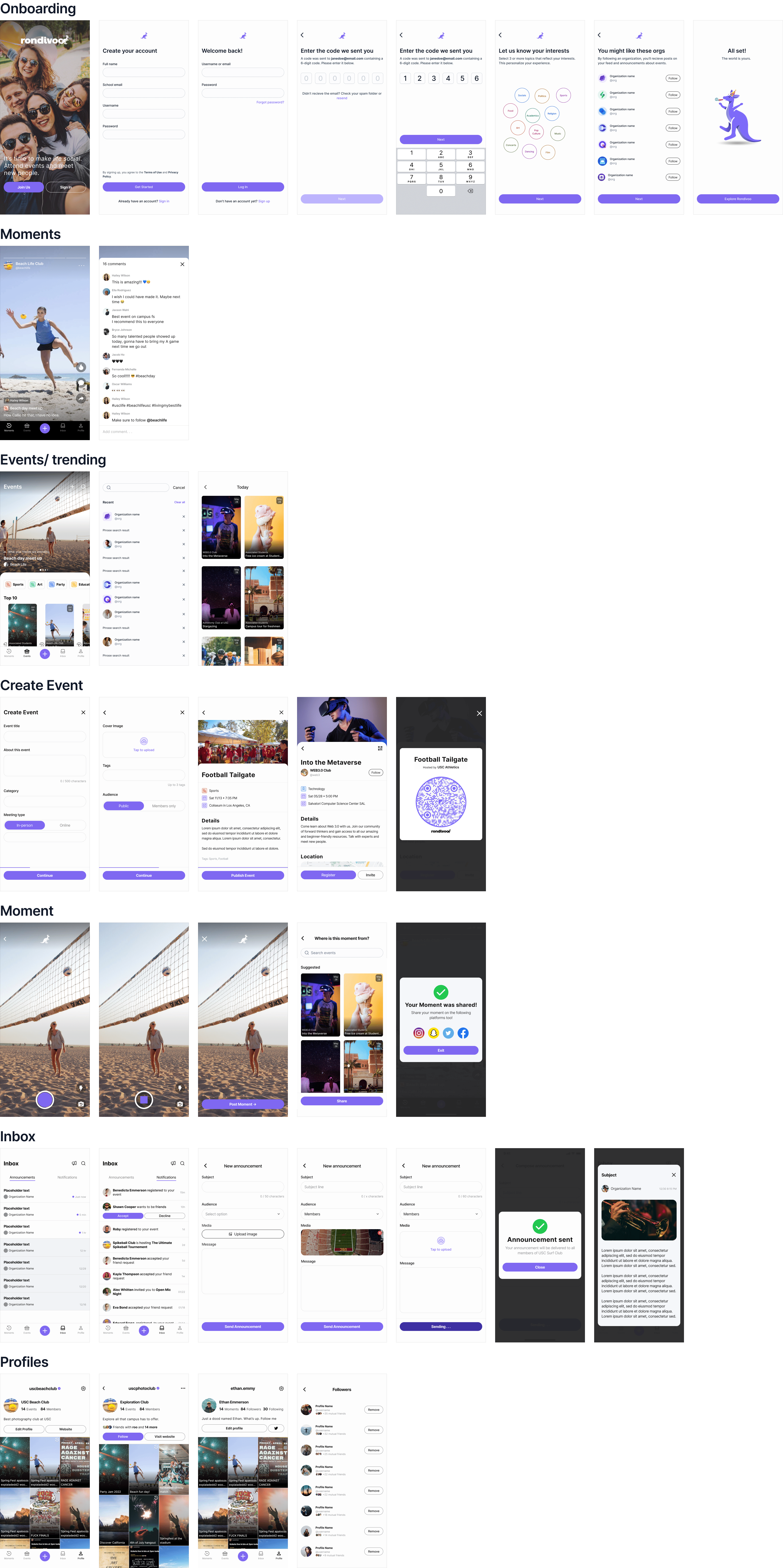
I mapped the information architecture — the paths students take through the app, organized by patterns like onboarding and settings — then synthesized the research into low-fidelity UI kits.
07 — Design system
A right-sized system
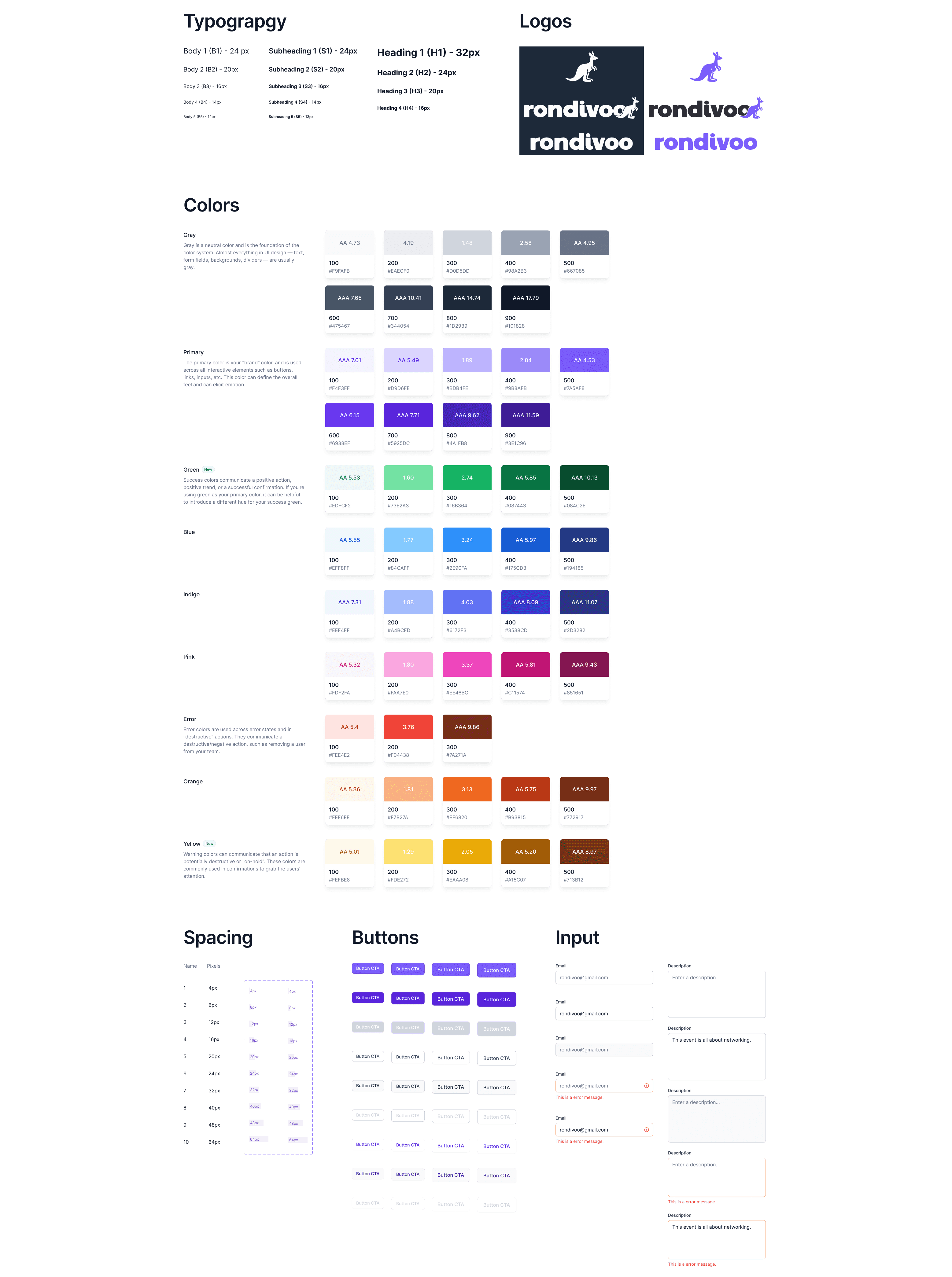
A full-scale design system wasn't the right investment for an early-stage startup. So I built a simple one — foundations and common components — enough to keep me and any future designers consistent and fast, without over-engineering it.
08 — Direction
Designing for a video-first generation
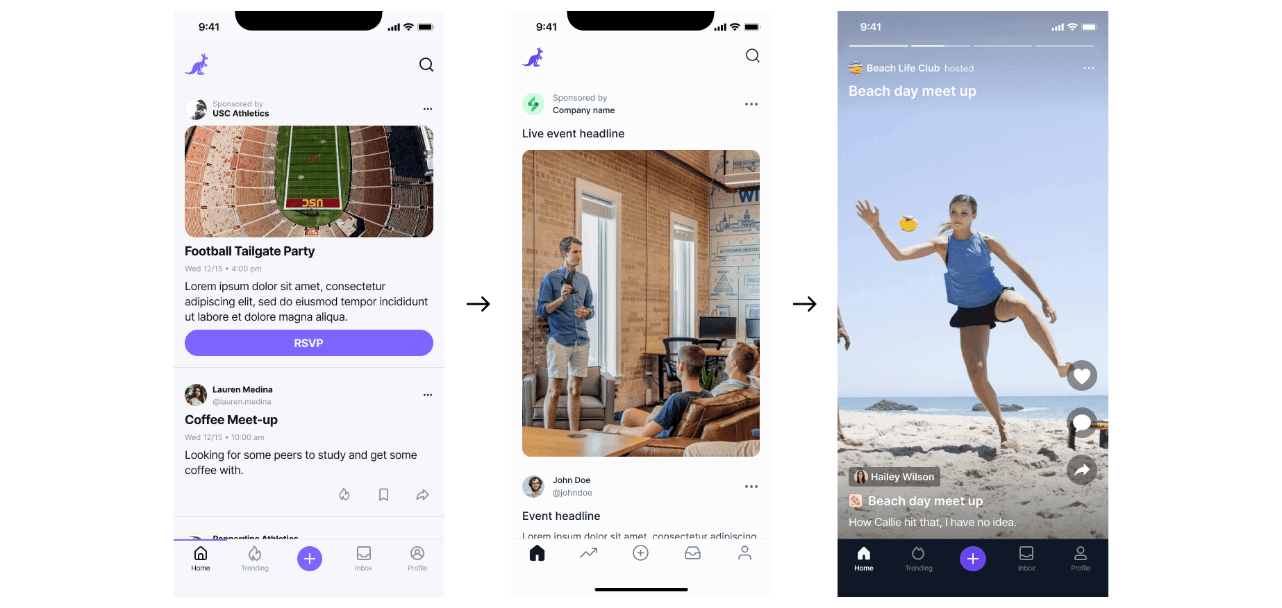
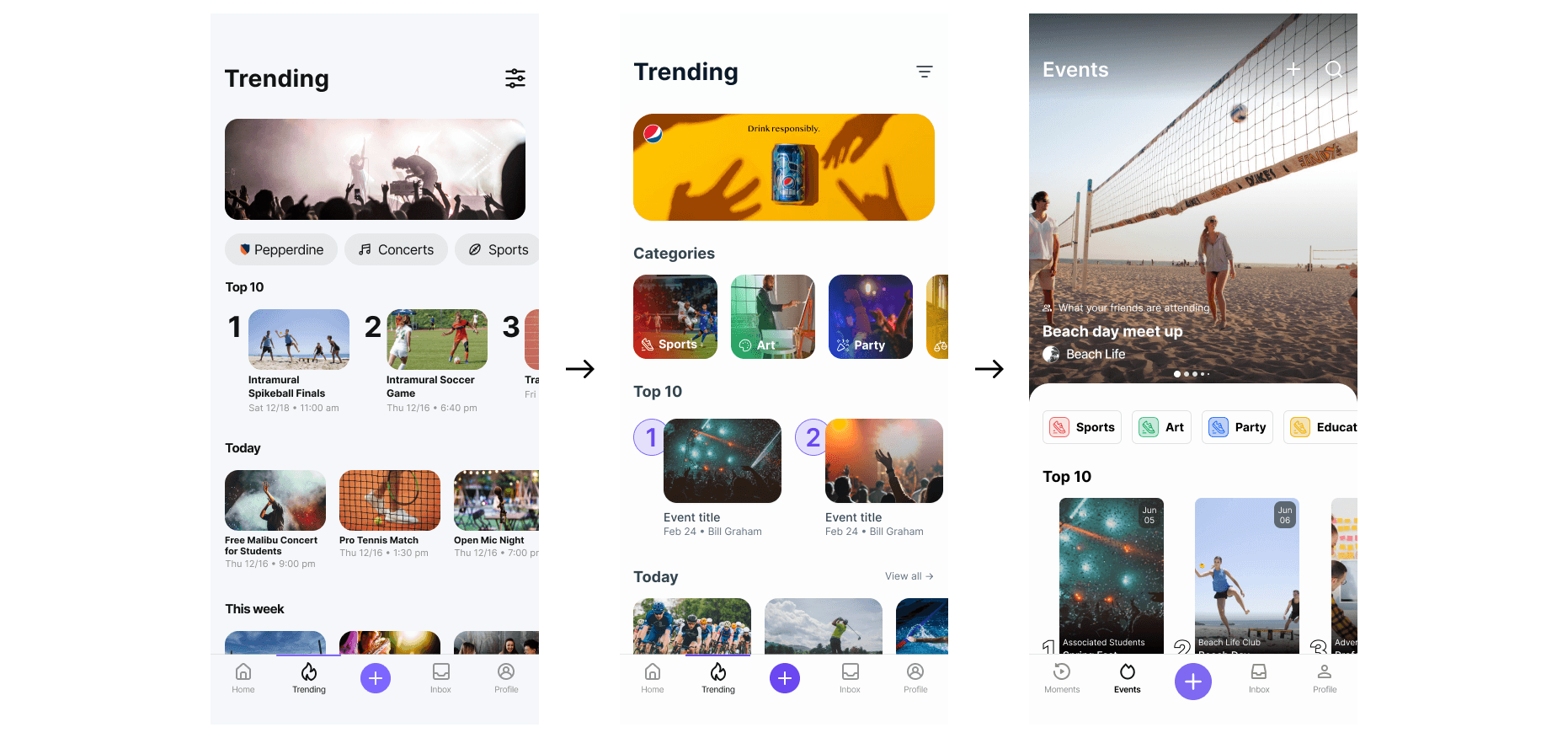
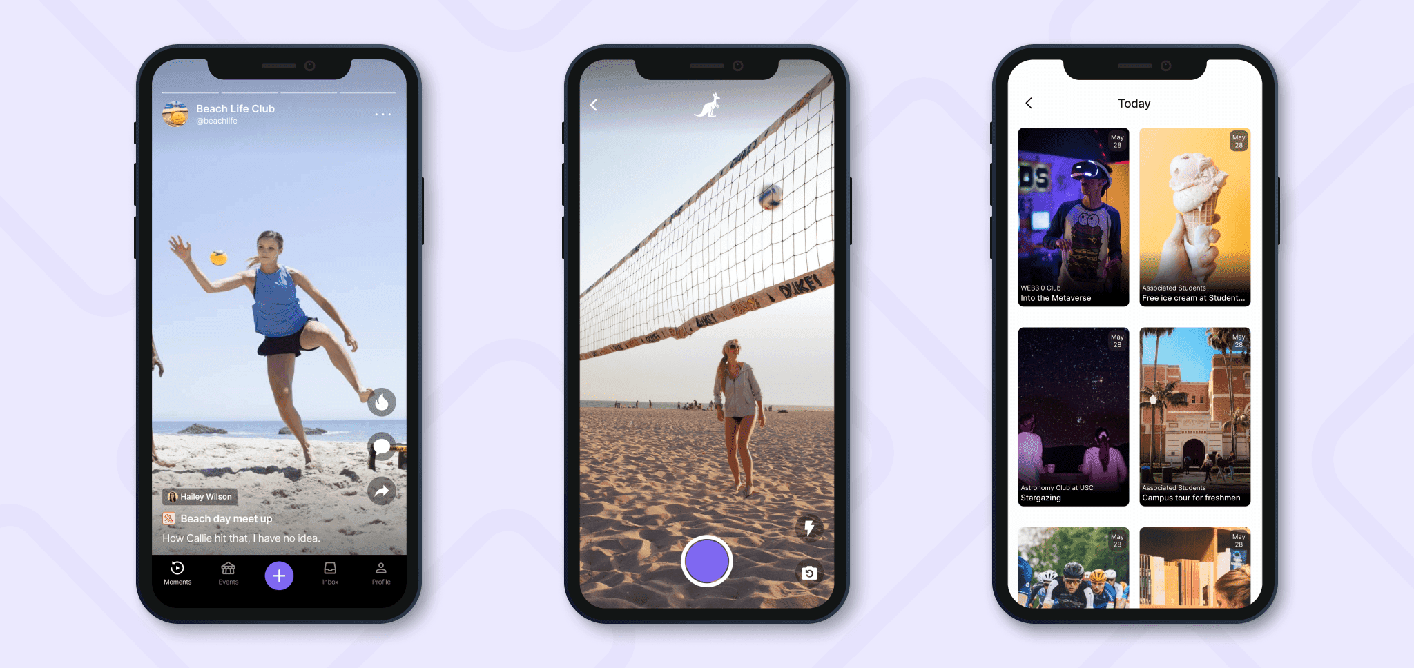
Gen Z lives in short-form video — TikTok, Instagram, YouTube. So I made Rondivoo video-first, despite the higher development and hosting cost: short-form is fast to consume and low-effort to create, which is exactly what gets students posting and showing up.
09 — Launch & brand
Shipping a brand, not just an app
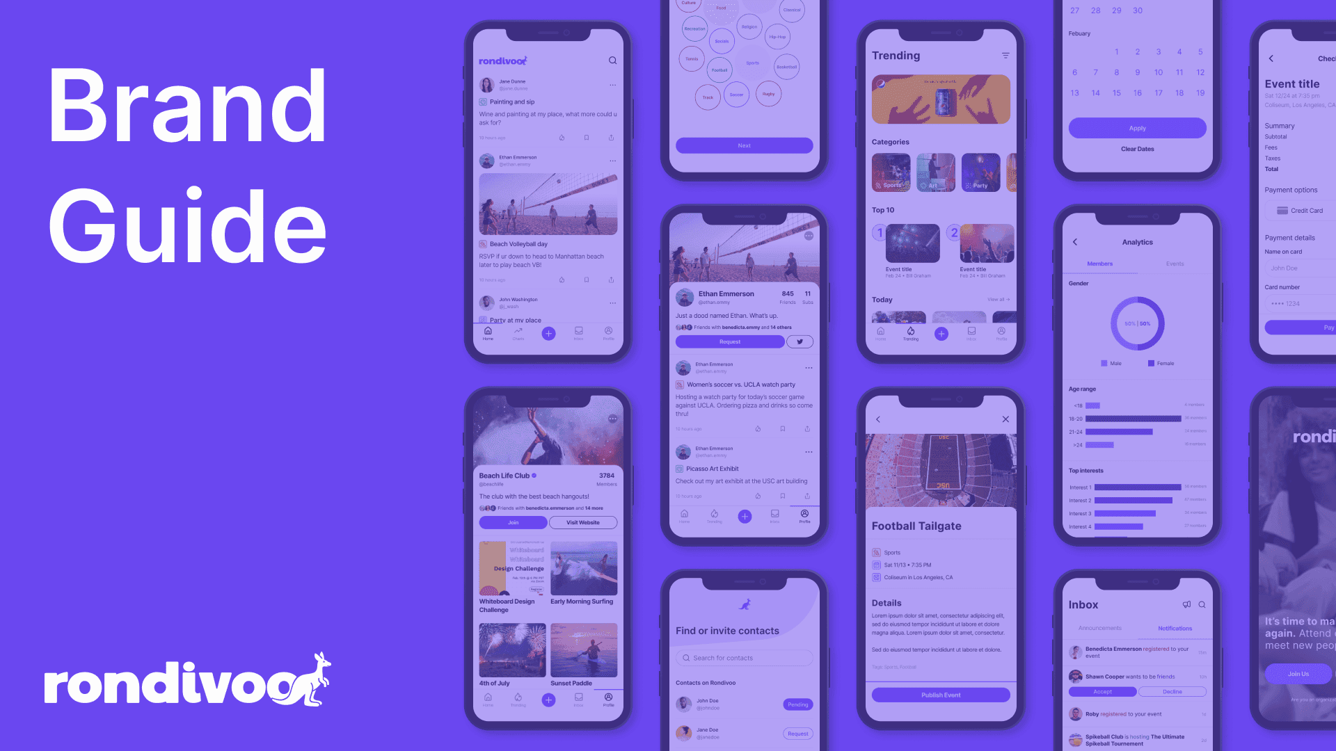
I wrote a full brand guide — visual identity, tone, and voice — so Rondivoo reads consistently inside the team and out to students. It launched at USC in Fall 2022, and we tracked immediate student buy-in plus 1-, 7-, and 28-day retention.
10 — Reflection
What I took away
Founding design meant wearing every hat — research, UI, brand — and making pragmatic calls under real constraints: a “good enough” design system, a bet on video, a launch deadline. The biggest lesson was designing for the team, not just the user — giving engineers and a marketer a shared system and brand to build from. Zero to one is less about the perfect screen and more about getting a real thing into real students' hands.