Quizlet · Intern Hackweek · 2022
Let's get engaged 💍
Study streaks that live on the home screen — not buried in a tab.
- Role
- Product & Visual Design
- Timeline
- 5 days · Aug 2022
- Team
- 1 design · 2 eng · 1 data
- Platform
- iOS & Android
- Status
- Shipped
01 — Overview
Meet students where they already are
Quizlet's User Growth team had been chasing motivation for a while — streaks, badges, achievements. The research kept landing on the same thing: a streak only works if the goal feels reachable and stays in sight.
So for Hackweek I asked a smaller question. What's the most-present surface a student already has? It had been in their hand the whole time — the home screen.
02 — The problem
Streaks worked. Nobody saw them.
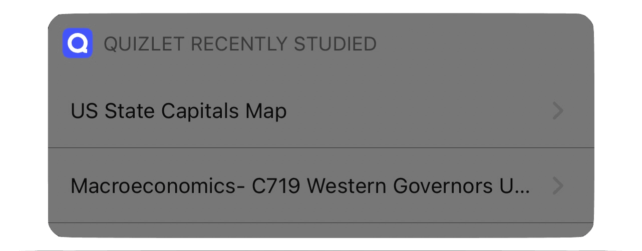
Students carry real stress and low confidence, and it quietly eats their motivation to study. The data drew the gap in sharp lines. For 2 in 3 users, the longest streak was a single day — and yet streaks, when they stick, drive 12M+ extra study sessions a year. The catch: they were buried in the profile tab, three taps deep.
A streak = consecutive days with at least one flashcard.
Out of sight, out of mind.
03 — The goal
Put motivation where they look
How might we push motivation past the app — onto the home screen students already check all day?
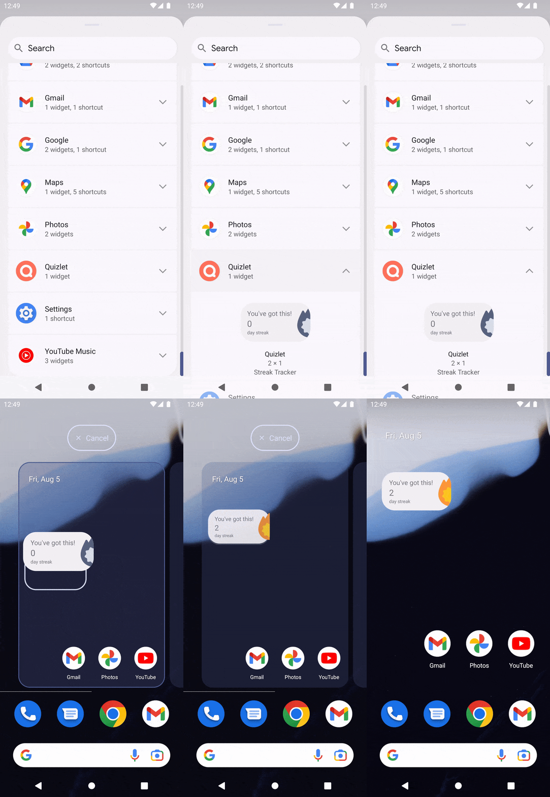
A few things had to be true. It had to show the interaction through motion, not copy; to motivate across the whole study journey, not just in-app; to celebrate the personal wins; and to reach Android 12+ and iOS 16+.
04 — Process · Journey
Where does motivation break?
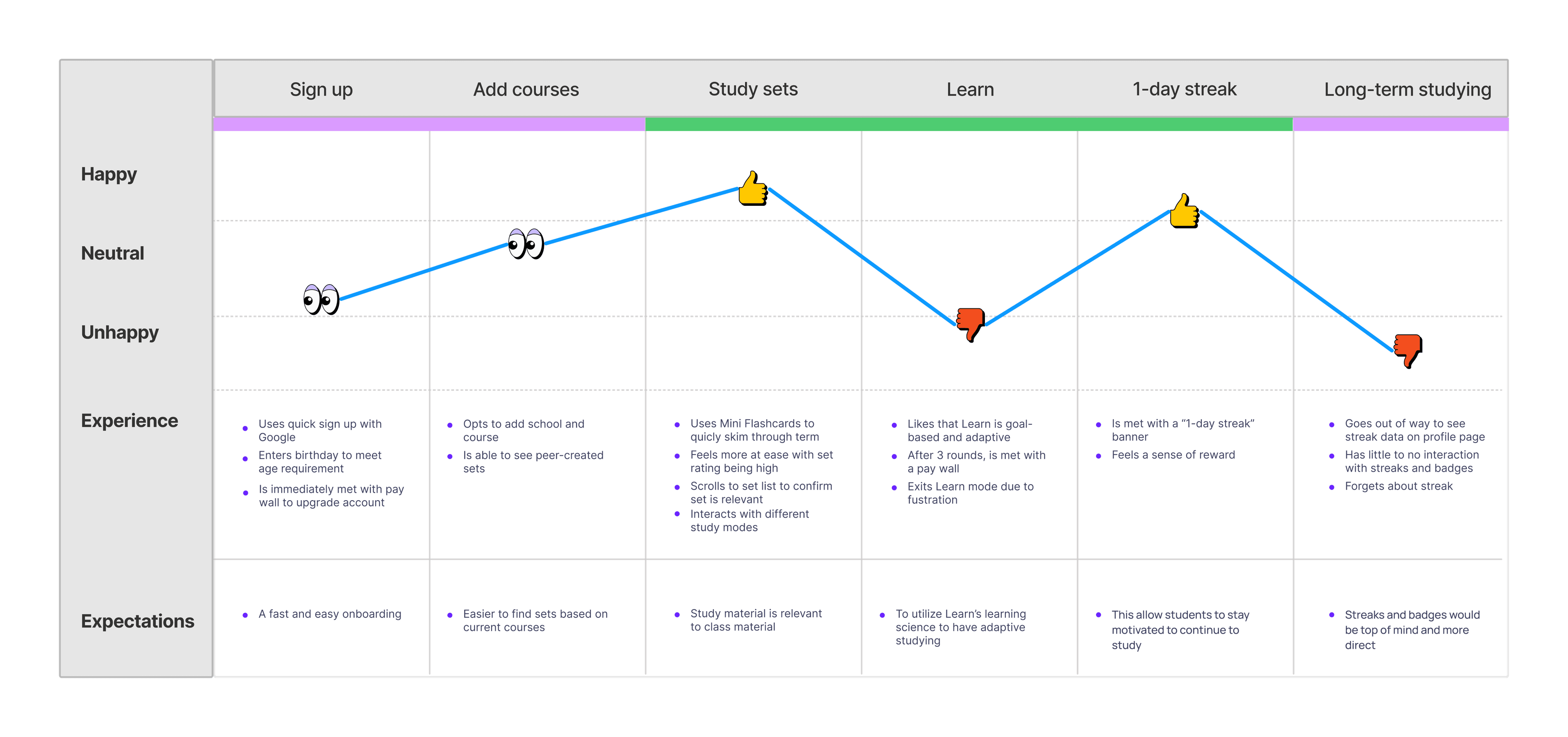
I mapped the journey from sign-up to long-haul motivation, building on the research team's work. The pattern was clear: students are mostly happy — but streaks go unused, because reaching them means a detour to the profile tab.
05 — Process · Research
How others keep people coming back
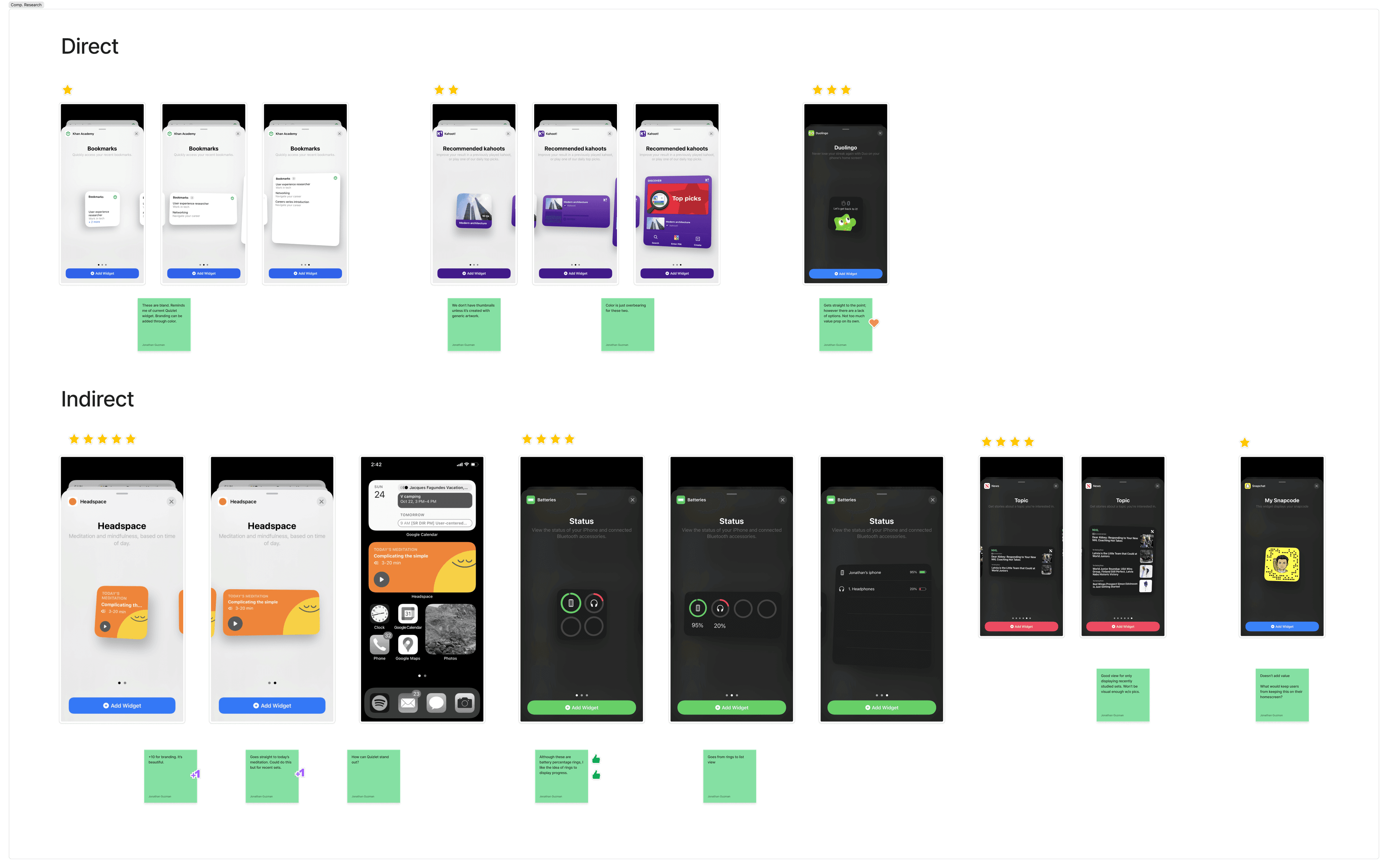
I looked at who else does this well — Kahoot!, Khan Academy, and Duolingo inside learning; Headspaceand Apple's own widgets outside it, for craft.
06 — Decisions
What I cut, and why
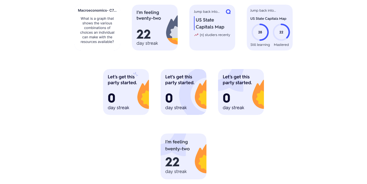
Starting at the smallest widget size, I generated a dozen directions in a day — HIG and Material Design 3 as guardrails, the team's critiques as a filter. The hard part wasn't adding things. It was cutting them.
The flashcard displaywent first — it just doesn't work at widget scale. “Recent studiers” followed, since the native app can't support it yet (a great social-proof idea for later). And the “Still learning / Mastered” counts had to go too — a Quizlet Plus feature, so most users would just hit empty states.
The hardest part was subtraction.

07 — The solution
One tap, back into studying
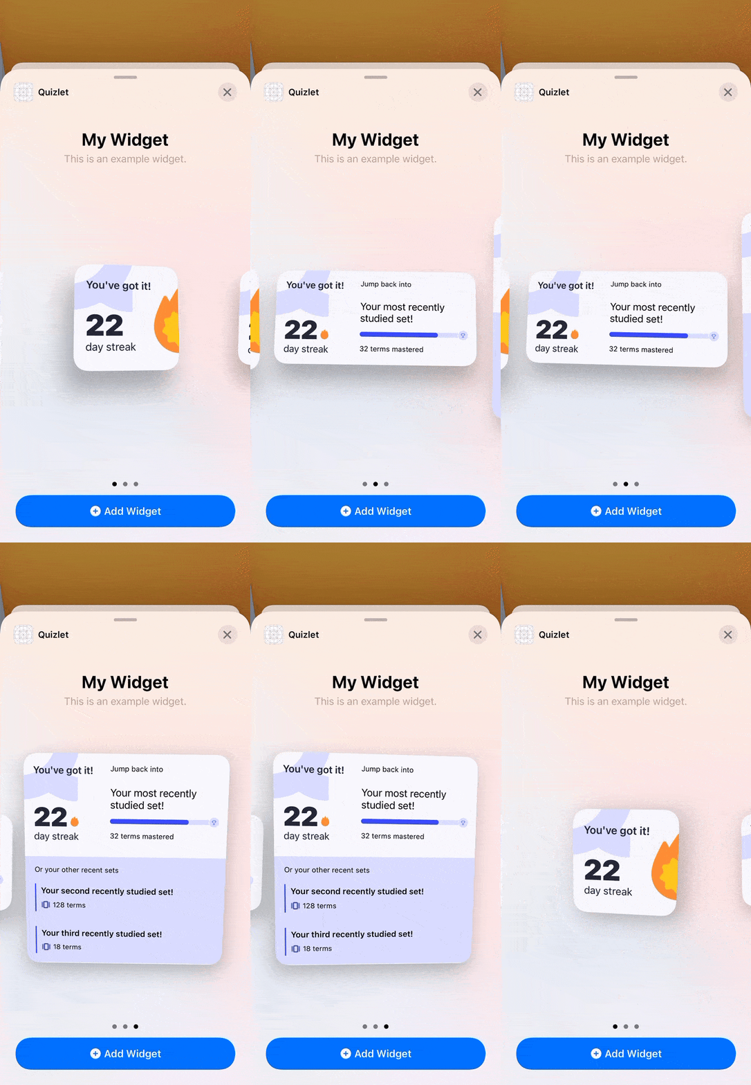
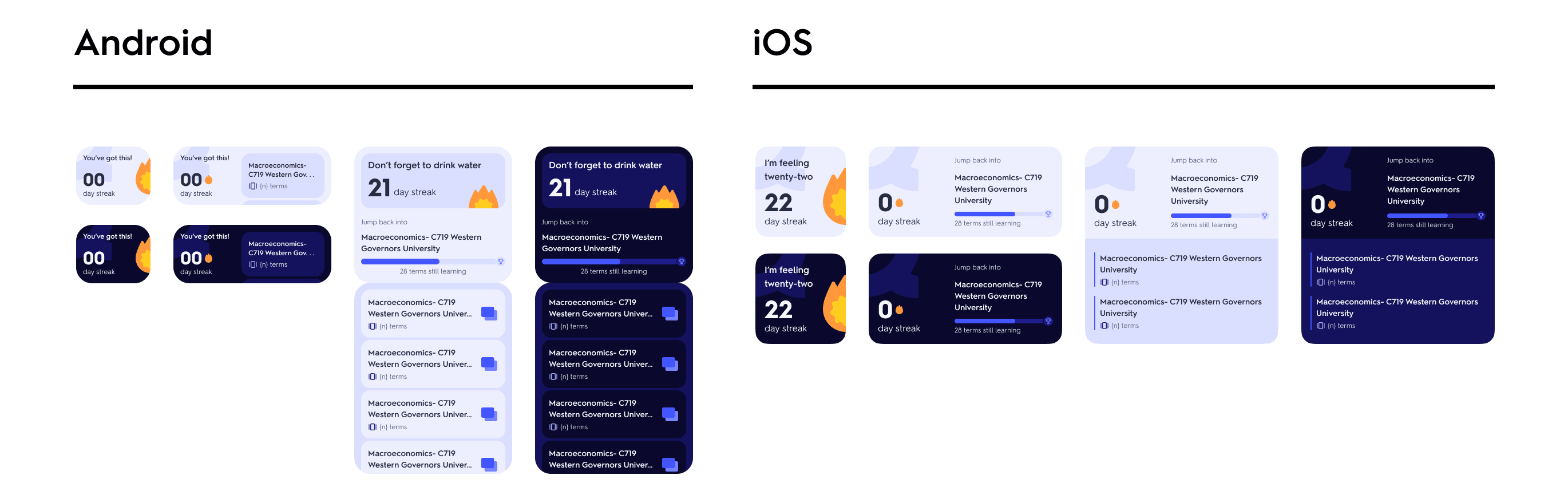
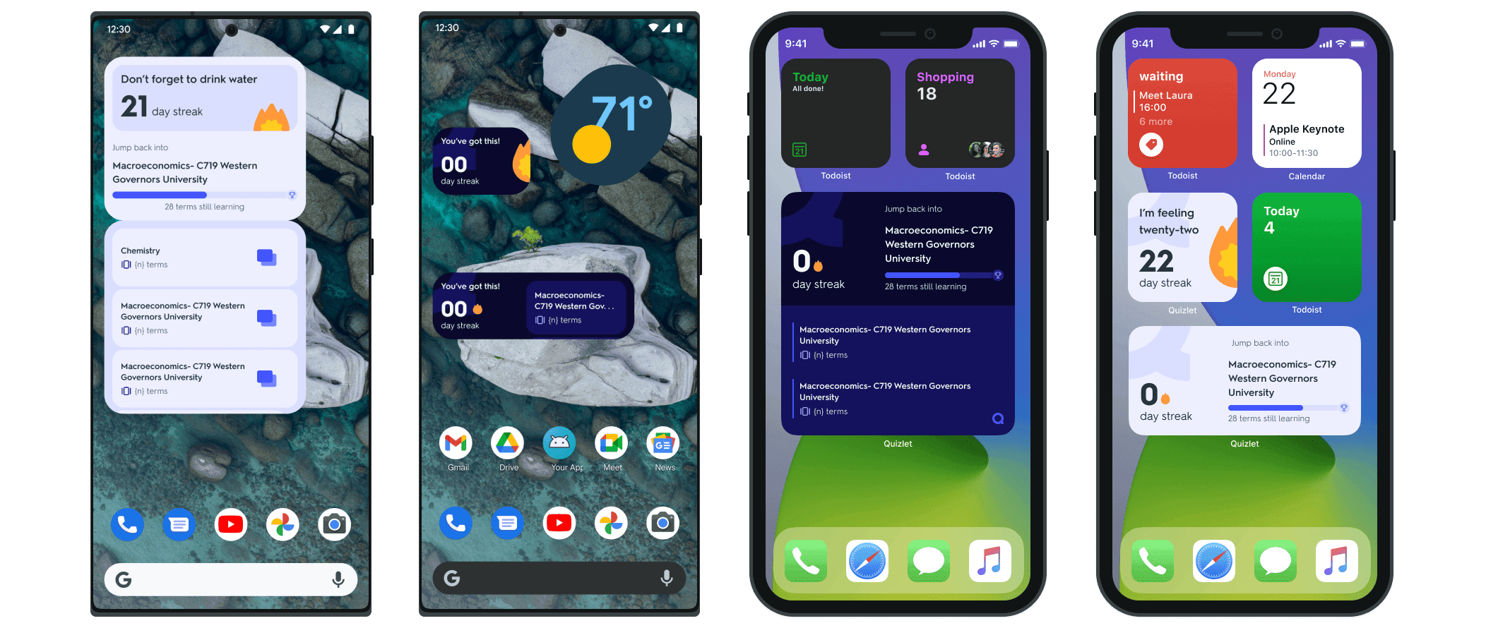
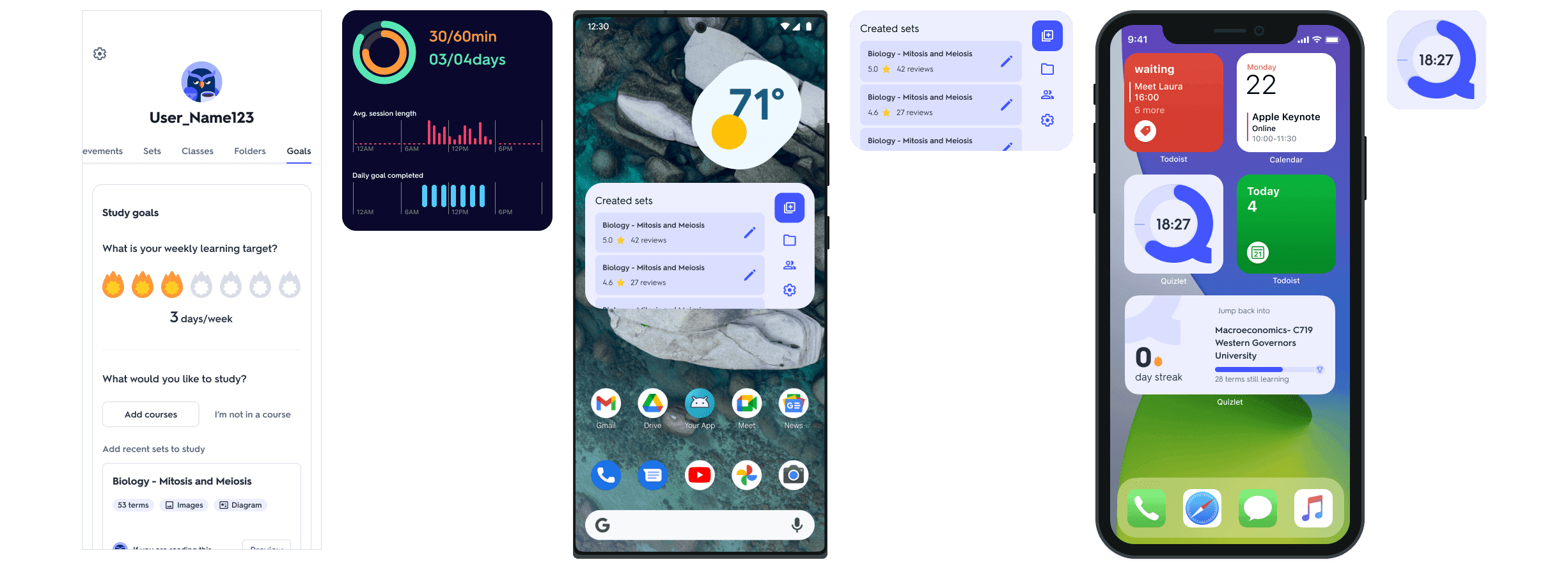
The widget leans on recently-studied sets. Tap one, and you're back in the cards — no app to open, no menu to dig through. It scales across sizes and both platforms.
08 — What's next
From reminder to companion
The widget is a starting point. Next: student-set targets, course shortcuts, and deeper recently-studied integration — turning a streak nudge into a real study companion.
09 — Outcome
What difference did we make?
At the end of Hackweek it won “Ship It Now” and “Crowd Favorite,” and entered the pipeline toward millions of users. The metrics we set out to move: time in app, time studying, and 1- / 7- / 28-day retention.
- “I love how you and the team expanded on a proven motivation tactic for learners.”
- “It looks like a polished and professional product that will fit well into the Quizlet ecosystem.”
- “It looks ready to be used by our users.”
10 — Reflection
What I took away
Five days forces honesty. The lesson wasn't visual — it was designing inside real walls (platform APIs, data, a paywall) and leaning on my engineers to know what was actually buildable. Ship beats perfect.